Skip to content
New issue

Have a question about this project? Sign up for a free GitHub account to open an issue and contact its maintainers and the community.

By clicking “Sign up for GitHub”, you agree to our terms of service and privacy statement. We’ll occasionally send you account related emails.

Already on GitHub? Sign in to your account

Line height vs. Block Char height #57

Closed
HoffmannP opened this issue Jul 20, 2013 · 7 comments
Closed

Line height vs. Block Char height #57

HoffmannP opened this issue Jul 20, 2013 · 7 comments
Assignees

Comments

@HoffmannP
Copy link

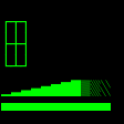
The Block Characters (mostly used to draw primitives in TUIs) are not fitting together as they are not as high as the line height - the Border Characters do, so it seems to be possible. See image below
pyd78n2q

@ghost ghost assigned frankrolf Jul 21, 2013
@frankrolf
Copy link
Member

Hi Peter,

thank you for your message.
It is hard to predict the line-height of different applications; and I could not find a standard value that works in all the different cases. I built the box drawing characters (top part of your PNG) in a way that line spacing up to 140 % is supported. The Block elements are based on the height of the em-square; and are limited by the character width; which is a practice I saw in other monospaced fonts.
What would you suggest as an optimal height for those? Maybe you can even point me to a standard or some documentation about the suggested height?

Thank you,
Frank

@miguelsousa
Copy link
Member

@HoffmannP Or if you can point out a font that works as you would expect, that would be helpful.

@eevee
Copy link

eevee commented May 12, 2014

I'm noticing this too. Flicking through some of the monospace fonts I have:

  • Source Code Pro: large vertical gap
  • Lucida Console: works pretty much perfectly
  • Inconsolata: slight vertical gap, slight horizontal overlap
  • Monaco: moderate vertical gap, slight horizontal overlap
  • Liberation Mono: works pretty much perfectly
  • Ubuntu Mono: works pretty much perfectly, albeit with some vertical banding within the characters themselves

All at 10pt, looking at a grid made of ▒s in LilyTerm (based on libvte).

@frankrolf
Copy link
Member

Hey Eevee,
For making more of this information, I would need some more context.
What means “works pretty much perfectly”? In which application/context,
which settings are used?

Thanks!
Frank

@HoffmannP
Copy link
Author

I have an comparision of the mono-fonts in my system used in mate-terminal:
852614707

@eevee
Copy link

eevee commented Jun 15, 2014

@frankrolf Using Source Code Pro, I see this:

But using Liberation Mono, I see this (in exactly the same part of the screen):

The latter is what I expect to see, since the Block Elements characters are supposed to fill their cell; there should never be a gap between vertically adjacent blocks. (I do appreciate that Source Code Pro isn't subject to whatever subpixel disaster befell Liberation Mono there :))

LilyTerm doesn't have any options concerning line height, so I definitely haven't changed that in any way.

@eevee
Copy link

eevee commented Jul 18, 2016

For posterity: looks like this was fixed in v2.015 (1.035 italic), released on May 2. Thank you! :)

Sign up for free to join this conversation on GitHub. Already have an account? Sign in to comment
Projects
None yet
Development

No branches or pull requests

5 participants