Visualizing similarities and differences between dating applications 📱💖
Data is gotten from https://en.wikipedia.org/wiki/Comparison_of_online_dating_services
- What is the major quirk/product of these apps?
- Who are these apps for?
- How do these apps match people?
- Where are these apps popular?
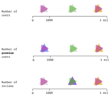
The different colors represent the different categories of the different apps while
the scale represents the number of users using apps in said categories.
This representation would represent the number of people using apps in certain
categories, the major quirks of all the apps.
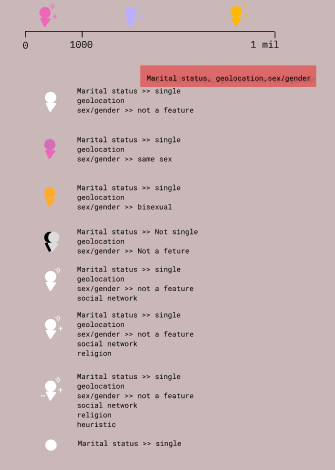
The different glyphs represnt the different quirks and subquirks found within the
apps and the scale would represents the count of apps with that quirk.
This answers the question of the major quirks of the apps and who the apps are for.
How do we get an accurate number of users of the app?
Who is the audience going to go through this?
What is the best format to present this as?