Walkthrough
This tutorial shows how to make a simple reading experience using the Treesaver JavaScript framework.
To avoid any licensing issues, all content used is in the public domain. Specifically, we make use of:
- Alice’s adventures in Wonderland: Public domain book from the 19th century
- Illustrations: Public domain illustrations from Sir John Tenniel
Important: In order to develop and test these samples on your computer, you must view them via a local web server (see FAQ).
The files used in the walkthrough, including intermediate steps, are all stored within the Treesaver Walkthough Repository.
We start with the Treesaver Boilerplate markup, replacing the dummy content with content from the first chapter. This gets us up and running with a functional, but very boring page:
- View source for files
- step1.zip: Zipfile with full sources
Even though the page is not visually appealing, there are quite a few behaviors built-in: you can switch pages via the mousewheel, keyboard, or by swiping on a touch device. If you change the height of the window, the layout will adjust and reflow (although it will always stay within a single column).
Although our page is somewhat functional, it is always a good idea to add buttons for switching pages, as well as a page count. We start by editing the Resources file (resources.html) and editing the Chrome markup:
  <div class="chrome">
    <div class="viewer">
    </div>
    <div class="controls">
      <div class="pagewidth">
        <span data-ts-template="position">{{pagenumber}} / {{pagecount}}</span>
        <button class="prev">Prev</button>
        <button class="next">Next</button>
      </div>
    </div>
  </div>
This markup adds:
-
Page numbers: Adding
data-ts-template="position"to an element will make a few variables available inside it; in particualr,{{pagenumber}}will be automatically updated with the current page number (use{{pagecount}}for the total number of pages). -
Previous & Next Buttons: Adding a CSS class of
nextorprevautomatically adds page turning ability to any element when clicked.
We now need to edit the style.css in order to size and position the UI we just added:
  .treesaver body {
    /* Hide scrollbars */
    overflow: hidden;
    /* Use full body canvas */
    margin: 0;
    border: 0;
    padding: 0;
  }

  .chrome, .viewer, .grid, .column, .container {
    /* Manually position everything */
    position: absolute;
    /* Make sure seams aren't visible */
    overflow: hidden;
    /* Set the base vertical grid */
    line-height: 20px;
  }

  /* Stretch the viewer to fill the screen */
  .viewer {
    top: 0;
    bottom: 40px;
    left: 0;
    right: 0;
  }

  .grid {
    width: 300px;
    border: 1px solid #ccc;
    margin: 9px;
    opacity: .25
  }

  .column {
    width: 280px;
    top: 5px;
    bottom: 5px;
    left: 5px;
  }

  #currentPage {
    opacity: 1;
  }

  .controls {
    position: absolute;
    bottom: 10px;
    left: 0;
    right: 0;
    height: 30px;
    line-height: 30px;
    font-family: Helvetica, Sans-Serif;
  }

  .pagenumbers {
    display: block;
    text-align: center;
    color: #999;
    font-size: 12px;
    font-weight: bold;
  }

  .controls .pagewidth {
    margin: 0 auto;
    position: relative;
  }

  .controls .next {
    position: absolute;
    right: 0;
    top: 0;
  }

  .controls .prev {
    position: absolute;
    left: 0;
    top: 0;
  }
The CSS here is fairly straightforward, the most important part is that we changed the .viewer clause to have bottom: 40px. Treesaver places all pages within this element, using the current dimensions in order to calculate the amount of space available for layout. We needed to adjust the bottom in order to give space for the buttons and page numbers.
The CSS also sets opacity: .25 on any .grid, while setting opacity: 1 on #currentPage. This makes the next and previous pages translucent, making the current page more prominent.
We finish this step off by adding a bit of styling to the buttons, using the CSS3 button styling by ubuwaits:

- View source for files
- step2.zip: Zipfile with full sources
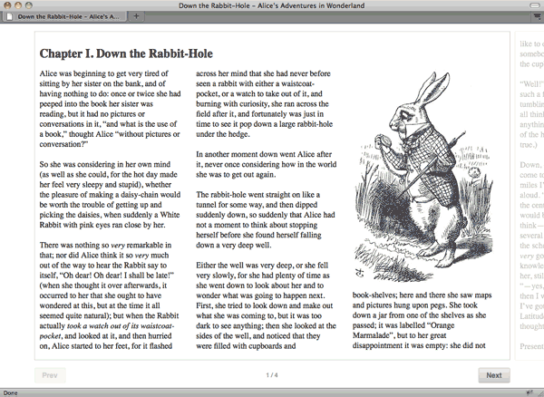
We now have a minimal, functional UI for our page. However, we are still stuck using a single-column layout for each page. We will add two and three-column pages by adding new Page Grids in our resources.html:
  <div class="grid cols-2">
    <div class="column"></div>
    <div class="column col-2"></div>
  </div>

  <div class="grid cols-3">
    <div class="column"></div>
    <div class="column col-2"></div>
    <div class="column col-3"></div>
  </div>
A Grid is like an empty page skeleton, Treesaver searches for Columns within a grid (a column is any element with the column class), and automatically fills the column with text until full. When all the columns within a grid have been filled, the page is complete.
As with Chrome, we use CSS in order to size and position each column. Add the following to the stylesheet:
.grid {
  width: 310px;
  border: 1px solid #ccc;
  margin: 9px;
  opacity: .25;
  min-height: 30px;
}

.cols-2 {
  width: 620px;
}

.cols-3 {
  width: 940px;
}

.column {
  width: 280px;
  top: 15px;
  bottom: 15px;
  left: 10px;
}

.col-2 {
  left: 320px;
}

.col-3 {
  left: 630px;
}
This CSS accomplishes the following:
-
Positioning Columns: Treesaver gives designers complete control over column sizing and placement, via absolute positioning. In the
.columnclause, we settopandbottomto 15px in order to give a bit of whitespace between the columns and the page border. Theleftproperty is used to horizontally position each column, otherwise the columns would overlap each other. -
Setting Grid width: By adding the CSS class
cols-2orcols-3to the grids, it is relatively simple to adjust the grid width in order to have space to place each column. We have calculated the width based on the number of columns, and the amount of whitespace we want around each column. For instance, the two-column grid has two columns that are 280px wide, plus a 30px gutter and 15px between the columns and the outer page border (280 * 2 + 30 + 15 * 2 = 620).
Loading the page, we can now resize and see the content transitioning between one, two, and three-column pages:

- View source for files
- step3.zip: Zipfile with full sources
So far, all of the page content flows automatically through each Column. This works fine for body text, but it is insufficient for design elements that span across multiple columns. In order to layout content outside of the main content flow, we use a Figure. Start by adjusting the markup used for the chapter title in our content HTML file:
  <figure>
    <h2 data-sizes="title fallback">
      Chapter I. Down the Rabbit-Hole
    </h2>
  </figure>
Here we wrap the chapter title within a <figure>, which is an element introduced in HTML5 (don't worry about older browsers that don't support HTML5, Treesaver handles that automatically).
Within the figure, we add the custom data-sizes attribute with two values, title and fallback. Treesaver uses these values to know where the contents of the figure can be positioned. The value title is one we made up and will use for placing the name of the chapter. However, fallback is a reserved name that indicates that this content should be placed in with the body text if the figure cannot be positioned otherwise (more on that later).
Now we need to adjust our Grids in order to provide a place for the title to be placed, we do so using a Container in our resources.html:
  <div class="grid">
    <div class="container" data-sizes="title"></div>
    <div class="column"></div>
  </div>

  <div class="grid cols-2">
    <div class="container cols-2" data-sizes="title"></div>
    <div class="column"></div>
    <div class="column col-2"></div>
  </div>

  <div class="grid cols-3">
    <div class="container cols-3" data-sizes="title"></div>
    <div class="column"></div>
    <div class="column col-2"></div>
    <div class="column col-3"></div>
  </div>
In this markup, we have added a container to each our grids. Using the data-sizes attribute, we have indicated that the container accepts any figure with content that has a data-size value of title.
As with Grids and Columns, we must use CSS to size and position our Containers in style.css:
.column, .container {
  width: 280px;
  top: 15px;
  bottom: 15px;
  left: 10px;
}

.container.cols-2 {
  width: 600px;
}

.container.cols-3 {
  width: 920px;
}
As a base, we use the same positioning for containers as we do columns; that way, they will line up correctly within our page grid. Since we want the titles to span across all columns, we manually set the width of our two and three-column containers.
If we reload the browser, we now see that the chapter title now spans across all three columns on the page:

- View source for files
- step4.zip: Zipfile with full sources
Now we will use Figures to add images. We begin by adding the following markup into our content, right after the second paragraph of text:
  <figure>
    <img data-sizes="single" src="../img/01-rabbit-280.jpg"
        width="280" height="429"
        alt="An illustration of a white rabbit Looking at a pocket watch">
  </figure>
Just like the chapter title in the last step, here we wrap the illustration in a Figure. This time, we set the data-sizes attribute to single, as in single-column (like CSS class names, this name is arbitrary). This is because the image is 280 pixels wide, the same as a single column.
We do have another illustration of Alice that is two columns wide, we will use the following markup for the second image:
  <figure>
    <img data-sizes="single" src="../img/02-alice-door-280.jpg"
        width="280" height="288"
        alt="An illustration of Alice looking at a small door behind a curtain">
    <img data-sizes="double" data-src="../img/02-alice-door-600.jpg"
        width="600" height="617"
        alt="An illustration of Alice looking at a small door behind a curtain">
  </figure>
This time, we have two <img> tags in our markup. The first <img> (named single) is 280 pixels wide and used as the one-column version, while the second (named double) is 600 pixels wide and used as the two-column version.
Also note that the second <img> tag uses the data-src property instead of the src property. This is in order to prevent non-Treesaver browsers from downloading both images. Treesaver will automatically rename the data-src property to src when performing layout.
Now we must add containers that can accept one and two-column images. First, make some modifications to the Resources file. First:
  <div class="grid">
    <div class="container" data-sizes="title single"></div>
    <div class="column"></div>
  </div>
Changing our one-column grid is fairly straightforward, since we already have a single-column container. By adding single to the data-sizes property, our Grid can now display both titles and single-column images.
  <div class="grid cols-2">
    <div class="container cols-2" data-sizes="title double"></div>
    <div class="column"></div>
    <div class="container col-2" data-sizes="single"></div>
    <div class="column col-2"></div>
  </div>
Similarly, in our two-column grid we can reuse the container, adding double to the data-sizes attribute. However, we still need a container for single-column images. We do so by adding a second <div class="container"> into our markup. But instead of inserting the element into the beginning of the Grid, we insert it just before the final column. We do this because Treesaver automatically adjusts the size of any Column that appears after the Container. The first container is two-columns wide, so both columns appear after it in the markup; since the second container is only one-column wide (and in the second column), it appears only before the final column.
  <div class="grid cols-3">
    <div class="container cols-3" data-sizes="title"></div>
    <div class="column"></div>
    <div class="container col-2 cols-2" data-sizes="double"></div>
    <div class="column col-2"></div>
    <div class="container col-3" data-sizes="single"></div>
    <div class="column col-3"></div>
  </div>
We do not reuse the title container in the three-column grid, instead we create two new Containers: one for single and the other for double. As with the previous grid, we make sure that the order of containers and columns in the markup gives us the correct column sizing (see the documentation on Containers for a detailed explanation here).
If we view the page in the browser, we will now see images included in some of the pages:
- View source for files
- step5.zip: Zipfile with full sources
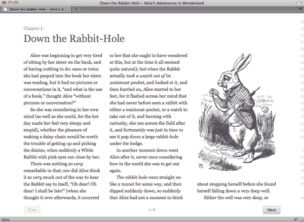
Before we get too far along, let’s add some typographic touches. First, we need to tweak our chapter heading:
  <figure>
    <h2 data-sizes="title fallback">
      <span class="chapter">Chapter I:</span>
      Down the Rabbit-Hole
    </h2>
  </figure>
Now the chapter number is enclosed in a separate <span> that can be styled. With that in place, we apply some basic typographic tweaks:
  body {
    font-family: Georgia, Serif;
    font-size: 16px;
    color: #434;
  }

  h2 {
    font-size: 36px;
    line-height: 48px;
    font-weight: normal;
    margin: 24px 0;
    color: #666;
  }

  h2 .chapter {
    display: block;
    font-size: 16px;
    line-height: 24px;
    color: #999;
  }

  p {
    margin: 0;
    text-indent: 24px;
  }

  hr {
    margin: 24px 0;
    border: none;
    padding: 0;
    height: 24px;
    background: url('../img/horizontal-rule.png') 50% 50% no-repeat;
  }
These changes are fairly straightforward if you are familiar with CSS. Let’s go a bit further in our styling, and tweak our page grid a bit:
  .grid {
    width: 280px;
    margin: 0 72px;
    opacity: .25;
    min-height: 30px;
  }

  .cols-2 {
    width: 590px;
  }

  .cols-3 {
    width: 910px;
  }

  .column, .container {
    width: 280px;
    top: 15px;
    bottom: 15px;
    left: 0;
  }

  .col-2 {
    left: 305px;
  }

  .col-3 {
    left: 615px;
  }
We have removed the border around each page, which means we no longer need the 15px of space we had on each side of the outer columns. This means we also need to reduce the width of each page by 30px. Finally, we have added 72px of margin on the left and right of each page, to give additional breathing room now that we no longer have page borders:
- View source for files
- step6.zip: Zipfile with full sources
This tutorial is still a work in progress, quite a few things are missing:
- Creating a Table of Contents and linking chapters together
- Proper styling for non-Treesaver capable browsers
- Providing fallback versions of illustrations for small screen devices
- Creating a cover page
- Others ...